10 SaaS Pricing Page Examples That Convert (and Why)
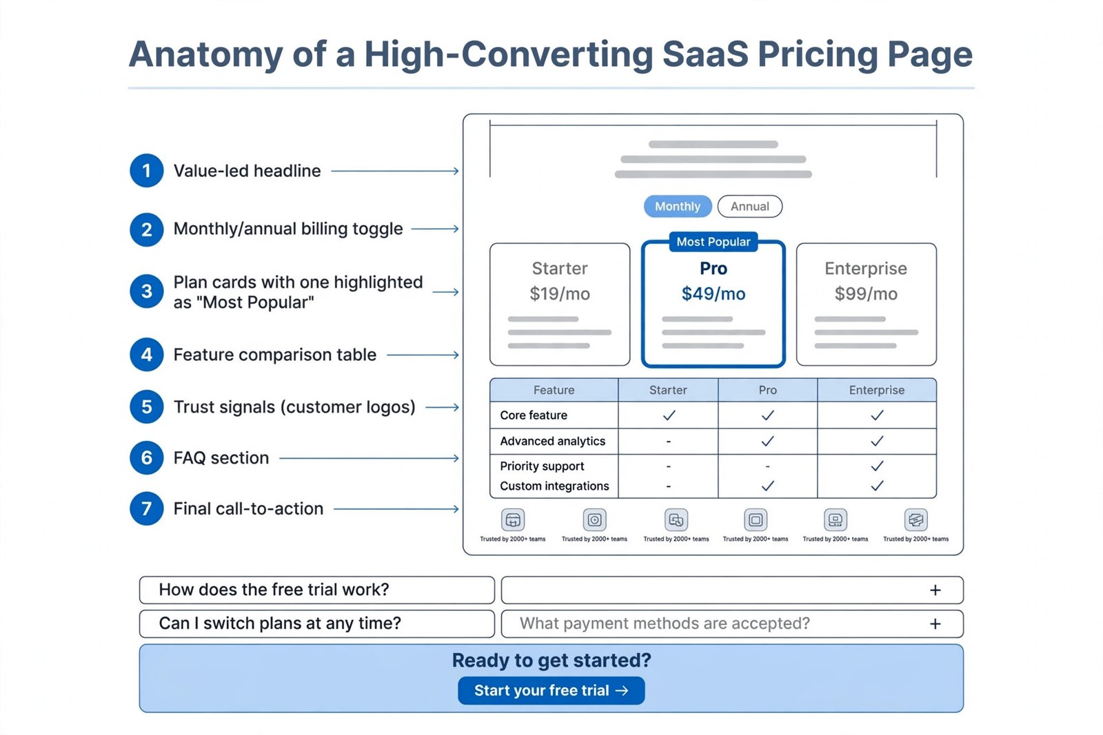
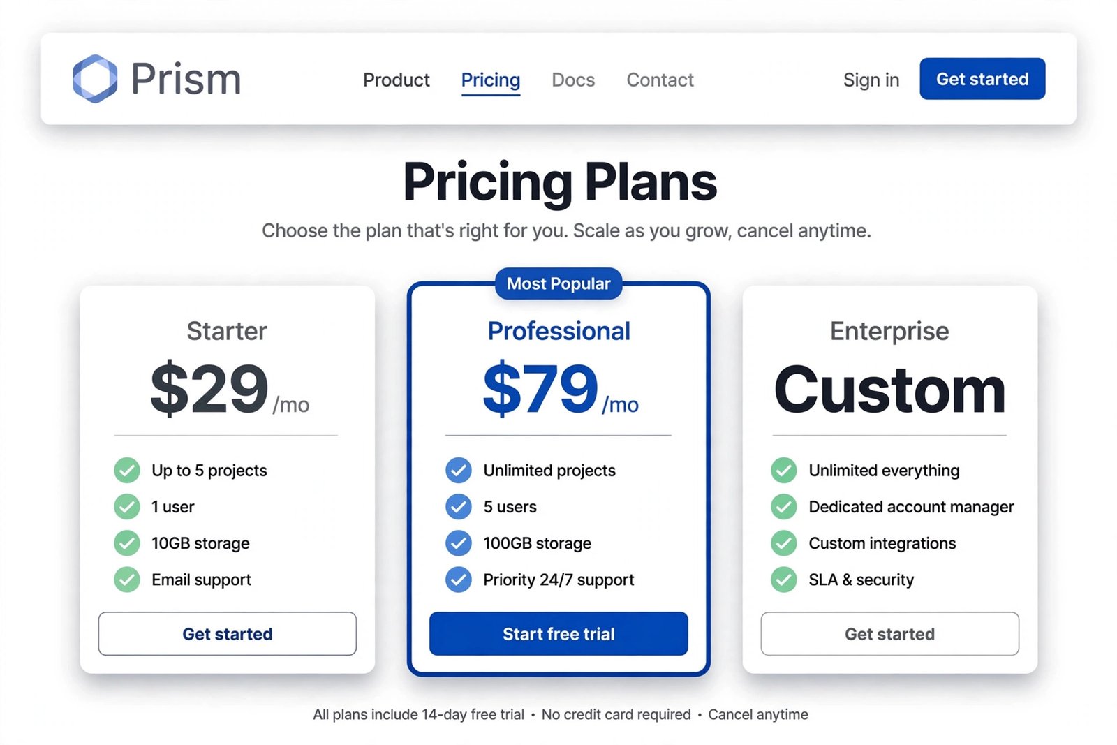
A SaaS pricing page has three jobs. Help the visitor pick the right plan in under a minute. Let them predict what they’ll actually pay — not just the headline number. And give them enough ammunition to get the purchase approved by whoever holds the budget.
Pages that do all three convert. Pages that do one or two leak buyers at the exact moment intent is highest — Gartner’s 2026 sales research found 67% of B2B buyers now prefer a rep-free buying experience, which means your pricing page is doing the persuasion work a salesperson used to handle.
I went through this year’s most-studied pricing pages — the ones conversion folks keep screenshotting — and pulled out the specific mechanics each one gets right. Not “clean design” hand-waving. The actual moves. Plus two things most roundups skip: what you’ll really pay versus the advertised price, and a 10-point audit you can run on your own page today.
A quick note before we start: prices below are October 2026 snapshots and change constantly. The mechanics are what matter — and what this post is really about. If you’re picking a model before you design the page, start with our guide to SaaS pricing strategies.
1. Slack — the fair-billing pioneer
Slack charges per user, but only for members who are actually active. Its Fair Billing Policy is the rare pricing footnote that became a marketing asset. Why it converts: it attacks the number-one fear of per-seat pricing — paying for seats nobody uses. Pattern to steal: put your most buyer-friendly policy where the price is, not buried in a help doc. Honest criticism: with four tiers plus add-ons, the page leans on its comparison table hard; first-time visitors can still feel the weight. See Slack’s pricing page.
2. Notion — the cleanest comparison table in SaaS
Four tiers, a generous free plan, and a comparison table that uses checkmarks, dashes, and highlighted rows so you can scan one column for the feature you care about. Why it converts: buyers self-serve the comparison without reading every line. Pattern to steal: highlight the actual differentiators in the table — don’t treat every row equally. Honest criticism: the free plan is so generous that some teams never feel the upgrade nudge. Great for adoption, slower for revenue. See Notion’s pricing page.
3. Linear — confidence as a conversion tactic
Linear runs four tiers with no “Most Popular” badge and no monthly/annual toggle in some views. It also writes different CTA copy per tier — “Start for free,” “Start free trial,” “Get in touch” — so each button signals a different level of commitment. Why it converts: the absence of hard-sell cues reads as confidence, which is its own trust signal for technical buyers. Pattern to steal: match CTA copy to the commitment each tier asks for. Honest criticism: no highlighted tier means undecided buyers get less guidance. This only works when your product sells itself. See Linear’s pricing page.
4. Stripe — radical transparency
No monthly subscription. Just per-transaction pricing and a rate calculator, right on the page. Why it converts: “we succeed when you succeed” is baked into the pricing model, not just the copy — and the calculator lets buyers predict their bill before signup. Pattern to steal: if your pricing is usage-based, give buyers a calculator, not a paragraph. Honest criticism: enterprise volume pricing still ends in a sales conversation. The transparency story has a ceiling. See Stripe’s pricing page.
5. Figma — seat types, finally explained
Figma’s page draws a hard line between editors and viewers: who pays, who doesn’t, and what each can do. It also surfaces nonprofit and education discounts plus “downgrade anytime” reassurance near the decision point. Why it converts: it answers the seat-model question every buyer asks (“do I pay for everyone?”) before they ask it. Pattern to steal: name exactly who counts as a paid seat. Honest criticism: per-editor pricing still surprises teams when viewer counts grow — the page could do more to model that. See Figma’s pricing page.
6. Calendly — tiers named after humans
Basic. Essentials. Professional. Teams. Enterprise. Calendly names tiers after buyer types, not growth stages — so you know which tier you are before reading a single feature bullet. Why it converts: self-identification short-circuits comparison. Once you’ve mentally placed yourself, the path to “start free trial” gets very short. Pattern to steal: name plans for who the buyer is, not how big you hope they’ll become. Honest criticism: minimal copy means power users have to hunt for limits like integration caps. See Calendly’s pricing page.
7. HubSpot — the bundle anchor
HubSpot’s pricing page is a masterclass in value anchoring: tiered bundles where the top tier makes the middle look reasonable, with “starts at” pricing for enterprise. Why it converts: bundles let buyers feel they’re buying an outcome (Marketing Hub) rather than a parts list. Pattern to steal: anchor with a premium tier even if few buy it — it reframes everything below. Honest criticism: real HubSpot bills famously exceed the “starts at” numbers once contacts and add-ons pile up. The page doesn’t warn you. See HubSpot’s pricing page.
8. Airtable — the annual toggle done right
Airtable’s monthly/annual toggle shows the discount as a green “save X%” badge that registers without shouting. Why it converts: the toggle makes annual savings feel discovered, not pushed — and annual commitments are worth real money. Pattern to steal: show annual savings as a percentage badge on the toggle itself. Honest criticism: the page is dense. Feature-rich products can’t fully avoid it, but first-time visitors scroll a lot. See Airtable’s pricing page.
9. Intercom — proof where the doubt lives
Intercom places customer quotes next to the tier the customer upgraded from — not in a generic logo bar below the fold, but contextually, where the relevant doubt sits. Why it converts: “a company like yours made this exact call” beats “users love us” every time. Pattern to steal: attach testimonials to specific tiers or decisions, not to the page in general. Honest criticism: modular pricing with add-ons can still produce bill shock. Proof doesn’t fix packaging complexity. See Intercom’s pricing page.
10. Monarch Money — the one-tier flex
Monarch Money (personal finance, but the lesson is SaaS-universal) runs essentially a single paid tier framed as “less than two cups of coffee per month.” Why it converts: one tier removes decision paralysis entirely — the only question left is yes or no. Pattern to steal: if your product has one natural price, don’t invent tiers just to look like everyone else. Honest criticism: single-tier only works when your audience is homogeneous. B2B with mixed buyer sizes can’t copy this directly. See Monarch Money’s pricing page.
The Entry Price Is Not the Price
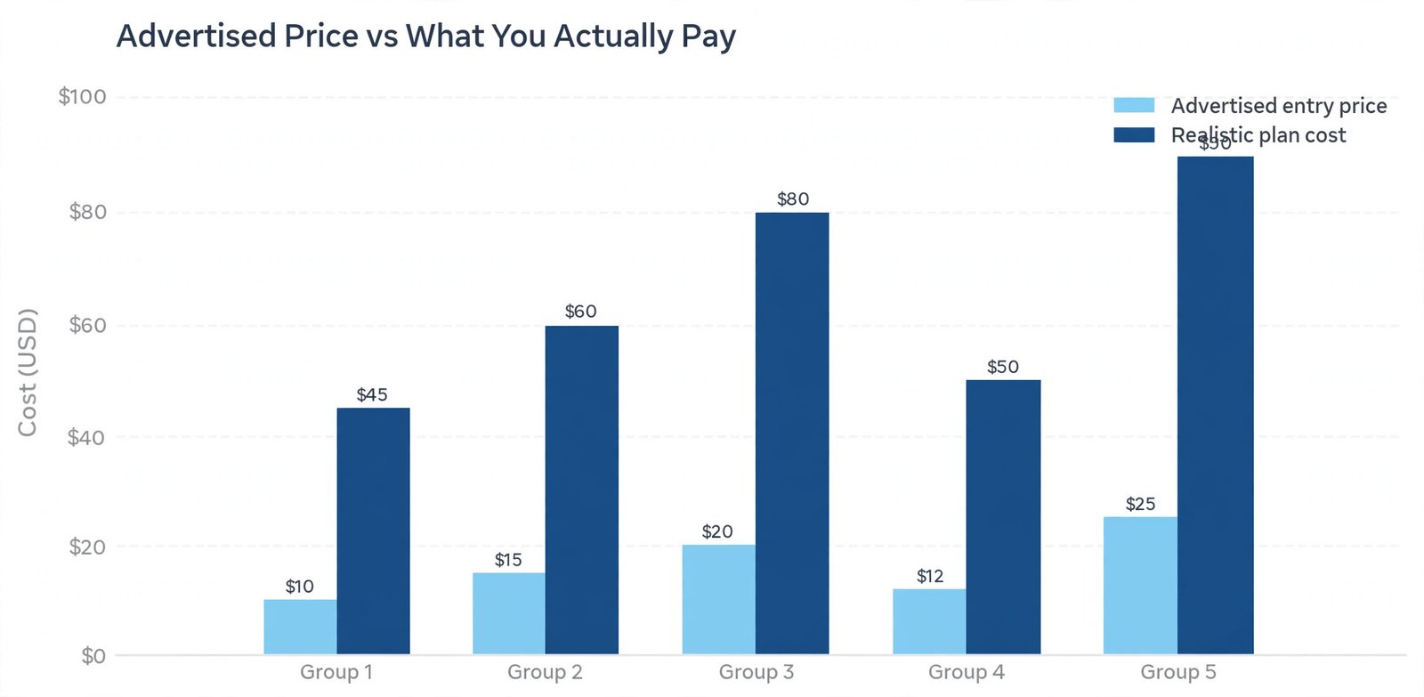
Here’s the part most pricing-page roundups skip. The number on the pricing page is the best-case number: one seat, annual billing, no add-ons, no overages. RealCostLabs rebuilt the published rate cards of 20+ marketing SaaS tools at realistic usage levels in 2026 and published the results on dev.to. Their finding: across 13 tools with a paid entry tier, the plan you realistically end up on costs a mean of 3.9x the advertised entry price (median 3.3x).
| Tool (per RealCostLabs, 2026) | Advertised entry | Realistic plan | Multiple |
|---|---|---|---|
| Close | $9 | $99 | 11x |
| Klaviyo | $20 | $150 | 7.5x |
| Mailchimp | $26 | $135 | 5.2x |
Two caveats, because honesty matters here. Prices change constantly — treat these as 2026 snapshots, not quotes. And the gap isn’t always deception; it’s seats, contacts, and usage doing what they do.
The practical takeaway cuts both ways. If you’re a founder in Texas budgeting your stack: multiply the headline price by three and see if the tool still earns its place. If you’re building a pricing page: this is exactly why calculators, seat estimators, and honest “what you’ll pay at 10 seats” examples convert — they answer the question every experienced buyer is already asking. And if billing complexity is the headache, our subscription management software guide covers tools built to handle it.
Pricing Psychology in Plain English
Four mechanisms run underneath nearly every page above. None of them requires trickery — they’re just how buyers think.
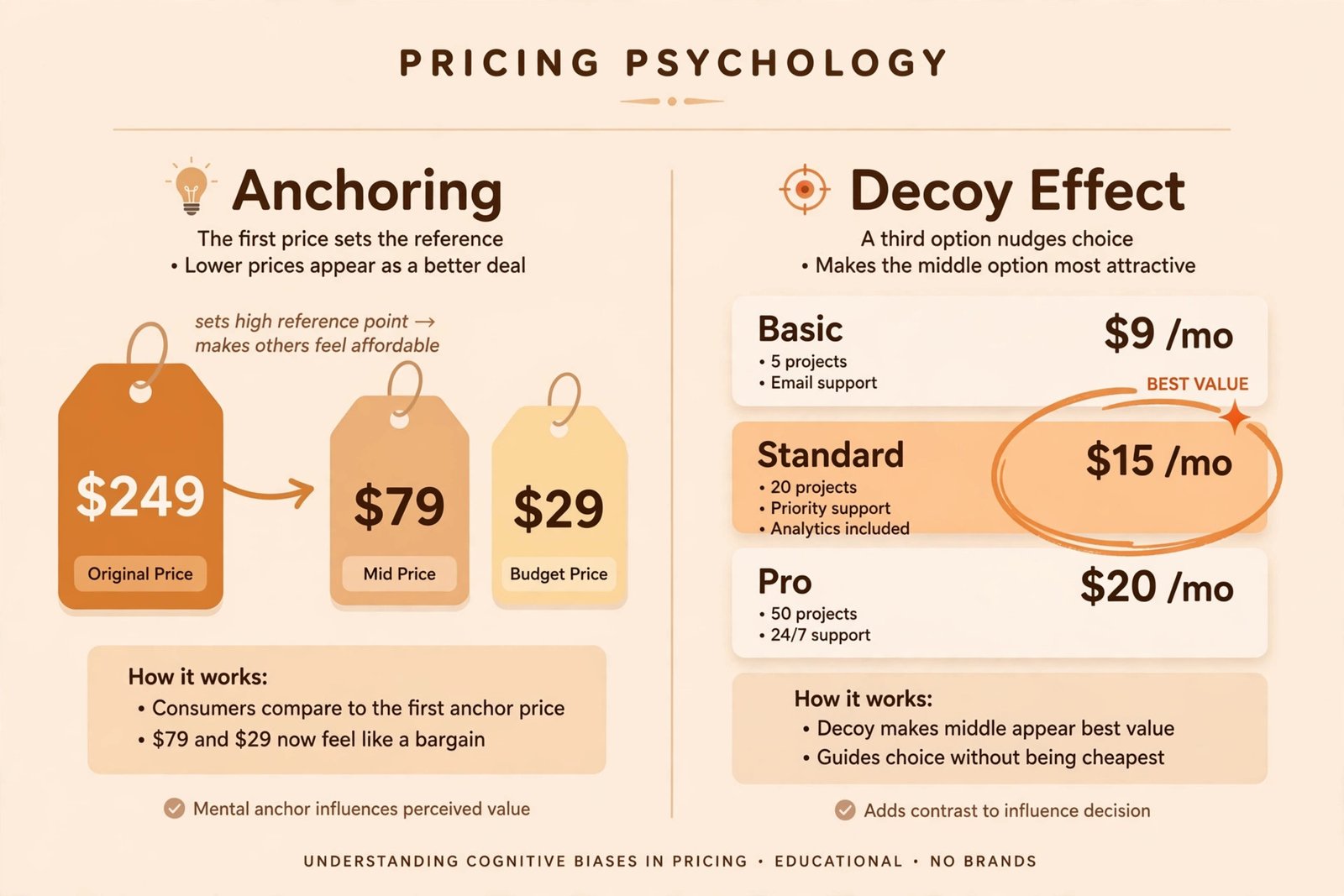
Anchoring. The first number a buyer sees shapes every number after it. Lead with the $249 enterprise tier and the $79 plan looks cheap; lead with free and $79 feels expensive. Tier order is a persuasion choice, not a design choice.
The decoy effect. In a three-tier setup, the middle tier is often engineered as the obvious choice — meaningfully better than cheap, far more accessible than expensive. The extremes partly exist to frame the middle as the smart pick.
The compromise effect. People avoid extremes. Buyers gravitate to the middle option even when the cheapest tier would cover them — which is why the “Most Popular” badge usually sits there. It confirms a choice they were already leaning toward.
Loss aversion. “You’ll lose access to your reports” outperforms “upgrade to keep your reports.” Same information, different emotional charge. The best pages state the situation honestly, because honesty is enough.
One more, less discussed: tax honesty. Almost nobody states whether prices include tax on the page itself. If you sell to buyers in the UK or EU, a one-line tax note removes a real objection. For the strategy behind all of this — packaging, positioning, willingness to pay — see how to price a SaaS product for early customers.
The 2026 Shift: Per-Seat vs. Usage-Based Billing
Watch AI products and you’ll see the trend: flat per-seat pricing is giving way to credits, tokens, and metered usage — sometimes layered on top of a seat fee. This makes the pricing page’s job harder, because “what will I pay?” now depends on behavior, not headcount.
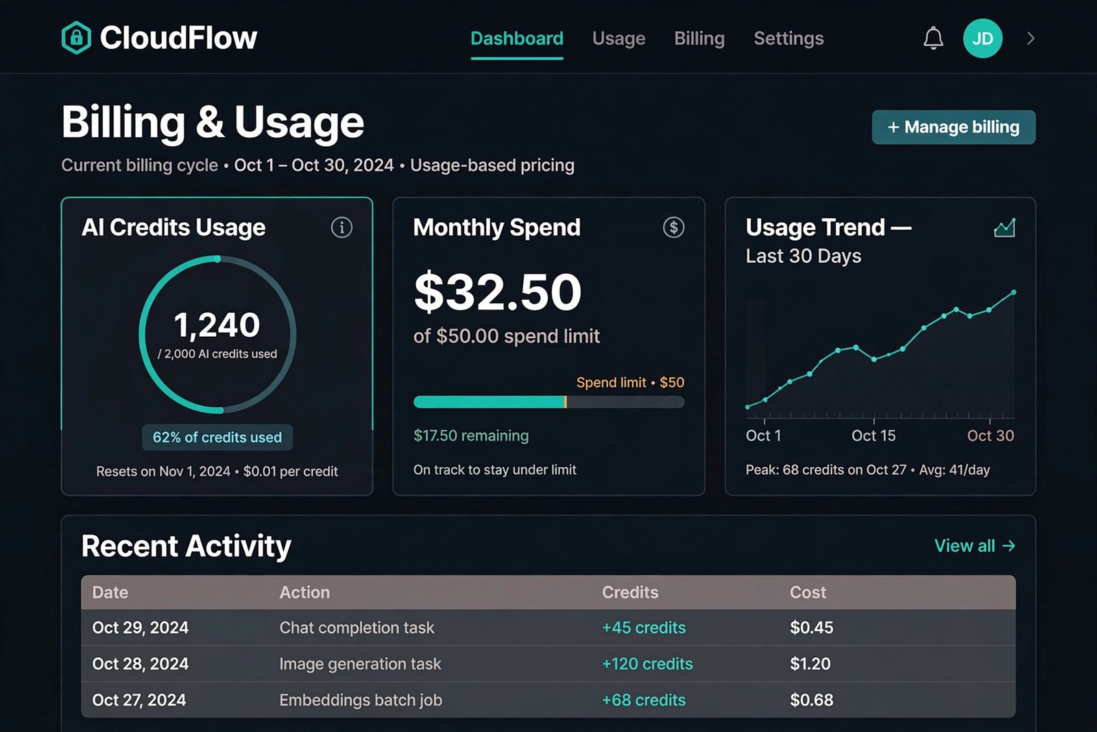
The pages handling this well share three moves: an on-page usage calculator, a visible spend limit or cap, and plain-English overage rules (“$0.01 per credit after 2,000”). If your product meters anything, those three elements aren’t nice-to-haves — they’re the difference between a buyer who signs up and one who bounces to a competitor with predictable billing. For background on how SaaS delivery shapes pricing, see what SaaS in cloud computing means.
Audit Your Own Pricing Page: The 10-Point Scorecard
This is the part no roundup gives you — a way to score your own page in ten minutes. One point per yes.
- Can a first-time visitor name their tier within 30 seconds, without reading the feature list?
- Is there exactly one highlighted or recommended plan — not two, not zero?
- Does the billing toggle show the annual savings as a concrete number or percentage?
- Is the price unit unmistakable — per user? per month? per 1,000 credits?
- Does each CTA say what actually happens on click (“Start free trial” versus a vague “Get started”)?
- Is there a comparison table a buyer can scan in under a minute?
- Does social proof sit next to the decision — not just a logo bar in the footer?
- Can the buyer predict their bill at 2x their current usage — calculator, estimator, or worked example?
- Does the FAQ answer cancellation, overage, and downgrade questions?
- Is there a low-friction way to ask one last question — chat, or a visible “talk to sales”?
8–10: your page is doing its job. 5–7: you’re leaking buyers at the highest-intent moment on your site — fix the no’s in order. Under 5: rebuild the page before you spend another dollar on ads.
Key Takeaways
- A pricing page has three jobs: help buyers pick a plan fast, let them predict the bill, and arm them to get the purchase approved.
- The best pages answer specific buyer doubts — not with prettier cards, but with sharper mechanics: fair-billing policies, buyer-type tier names, per-tier CTA copy, contextual proof, on-page calculators.
- The advertised price is rarely the real price. Realistic plans run roughly 3x the entry number (RealCostLabs, 2026) — so bill predictability is a conversion feature.
- Run the 10-point scorecard before your next redesign. Most pages fail on bill prediction and CTA clarity.
Frequently Asked Questions
How many pricing tiers should a SaaS page have?
Three is the most common setup: it gives buyers an anchor, a recommended middle, and room to grow without decision fatigue. Four works when your buyers genuinely split into four segments. More than four usually needs a comparison table to stay usable.
Should I show exact prices or “Contact sales”?
Show a real price whenever you can. With 67% of B2B buyers preferring a rep-free experience (Gartner, 2026), every “Contact us” is friction for that majority. Reserve it for genuinely custom enterprise deals. TrustRadius’s 2024 research found 51% of enterprise-price buyers most wished vendors had transparent pricing.
Monthly or annual billing by default?
Show both with a toggle, and make the annual savings concrete — “Save 20%” beats “billed annually.” Default to whichever your best customers choose; for most B2B SaaS, that’s annual.
Free tier or free trial — which converts better?
It depends on your activation. Products with fast time-to-value (Notion, Linear) win with generous free tiers that upgrade naturally. Complex products usually need time-boxed trials, sometimes with a salesperson assist. Match the model to your product, not your competitor’s.
How should I price AI credits on the page?
Show the credit math plainly: what one credit buys, what the included bundle covers, the per-unit overage rate, and a spend cap. Buyers tolerate usage pricing when they can predict the bill.
How do I know if my pricing page is working?
Track tier mix (are buyers landing on the tier you want?), the trial-to-paid rate from the pricing page specifically, and the questions your sales team or support inbox keeps answering. Every repeated question is a missing FAQ entry.